|
Getting your Trinity Audio player ready...
|
Having a good landing page conversion rate is crucial for the success of any business. It measures how effective each page of your website is at convincing visitors to take a desired action, such as subscribing to a newsletter or filling out a form.
WordStream states that the average landing page conversion rate across industries is between 3% to 6%. To measure your conversion rate, simply divide the number of conversions made to that page by the number of visitors who viewed it.
If you find that your current numbers aren’t reaching these benchmarks, there are several strategies you can employ to help improve them. First off, consider what types of messages and visuals you’re providing on your landing pages: do they look professional and present strong calls to action?
Remember that there is not one way to design a landing page. If you’re unsure what successful pages look like, consider these landing page examples of the great landing pages that have helped businesses succeed.
What is a Landing Page?
A landing page is a website page designed to attract traffic and generate interest in your product or service. There are many different landing pages, but they all share the goal of getting people to click through to another site.

The purpose of a landing page
A landing page provides a potential customer with a valuable resource, such as an eBook or webinar signup, in return for their basic contact information. The purpose of these pages is to generate leads and guide prospects through the customer funnel.
What Should a Landing Page Include?
The most effective landing pages typically feature specific elements that can help increase leads and conversion rates. Here are some elements that should be in a landing page to ensure success:
- The main message of the landing page should effectively communicate the benefits of the product or service being offered.
- Subheading to provides more details about the product or service mentioned in the headline.
- Persuasive content typically includes customer testimonials, reviews, and a list of features and benefits that emphasize the value of the product or service.
- A clear call to action (CTA) button or link that prompts visitors to take a specific action, such as making a purchase or filling out a form.
- Forms or other interactive elements provide visitors with the opportunity to provide information, ask questions, subscribe, or make a purchase.
- Images or graphics to enhance the product or service and improve the visual appeal of the landing page.
Always avoid using lengthy forms that request excessive information. Keep them short and to the point. You can collect details from your leads as you engage more with them.
What are the Best Landing Page Examples?
Landing pages on your website is one of the most important elements that will determine its success or failure. It’s the first thing visitors will see when they arrive on your site and should be able to quickly and easily capture their attention. A great landing page can help you convert more visitors into leads, increase sales, and build trust with potential customers.
Fortunately, there are a number of successful landing page examples out there that you can use as inspiration for your own.
Here are some of the best landing pages from around the web showcasing what works:
1. Wix
Wix has incorporated a visually appealing digital illustration on its landing page that remains visible as you scroll down. The design is well-balanced, with a good amount of white space and clear text.
We appreciate the use of design to highlight specific elements on this landing page example. In the illustration, the mountain’s peak indicates the main CTA, urging visitors to start building that website.
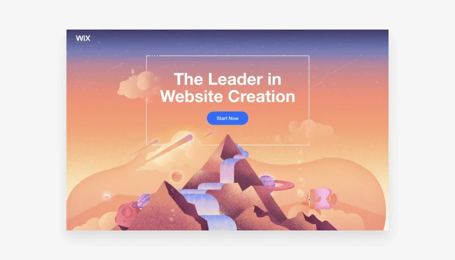
Why This Landing Page Design Works
- Simple and concise headline: “Create a Professional Website in Minutes”
- Visually appealing design that captures attention
- Clear CTA button: “Get Started”
- All the essential information is visible above the fold.
2. ExpressVPN
What are the most appealing aspects of this landing page? The website is lacking a navigation bar. ExpressVPN highlights the primary CTA by eliminating the navigation bar.
What is the reasoning behind taking an anti-navigation stance for landing pages? Visitors often get distracted and deviate from the intended action. This is considered a landing page design best practice, and A/B tests have shown that removing navigation links from landing pages can increase conversion rates.
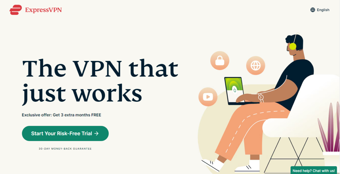
Why This Landing Page Design Works
- Minimalistic and clutter-free design
- Engaging background video
- Clear CTA button: “Get Started”
- Easy to understand headline: “The Most Trusted VPN Service”
3. Netflix
One of the best examples of landing pages that convert well is this signup page design from Netflix.
With this landing page example, you’re immediately faced with what they’re offering and the invitation to get started on entering the page. This removes the friction around making decisions, spurring people to take action quickly.
Why This Landing Page Design Works
- The headline is focused on the benefits and grabs attention immediately.
- The option to cancel at any time provides reassurance and eliminates any potential risk.
- The signup form for capturing leads has been optimized with only 1 form field, simplifying the sign-up process for users.
- The page provides easy access to essential information, with it being located at the top.
- Page copy emphasizes the benefits rather than the features, which is more compelling.
- The FAQ section helps to simplify the process of signing up.
- A second sign-up form is located at the bottom of the page to prompt users to sign up.
4. Zoom
Zoom is a widely used video conferencing software that caters to customers in diverse industries. It is logical for them to establish themselves as a leader in their area of expertise to potential customers.
The company has attempted this strategy by providing a free report that highlights them as a leader in meeting solutions. Users have the option to sign up and download the report for free.
Why This Landing Page Design Works
- The report is available for free, which increases accessibility to the information.
- The signup form is designed to include only necessary information, which helps to minimize form abandonment.
- This report provides an explanation of why Zoom is considered a leader and is worth reading. It generates interest, prompting users to register and download the file.
- The color contrast of the CTA button allows it to stand out from the page, enhancing its clickability.
5. Constant Contact
Similar to Zoom, Constant Contact provides its email marketing platform to a wide range of industries. However, in this landing page example, they are specifically targeting real estate companies.
The landing page design is simple, straightforward, and uncluttered. The website provides a complimentary download that includes valuable tips and success stories to assist with real estate marketing endeavors. Additionally, there is a call-to-action inviting users to try Constant Contact for no cost.
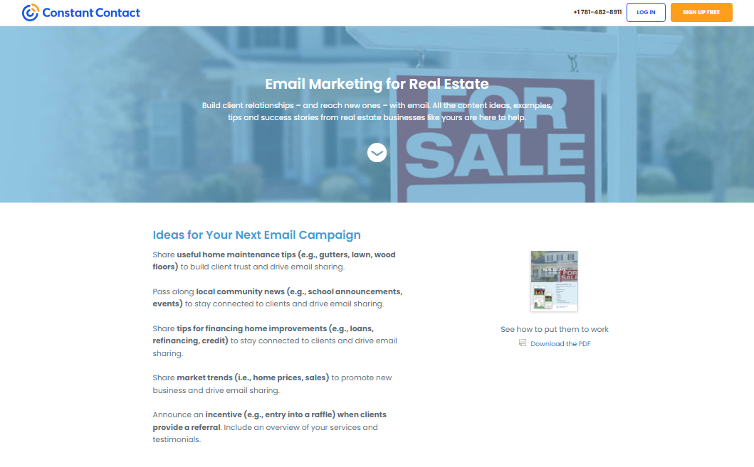
Why This Landing Page Design Works
- The headline and description provide a clear explanation of the benefits of downloading.
- The copywriting provides concise information about the benefits of reading the guide.
- Users have the ability to view a high-quality PDF preview in order to gain an understanding of its contents.
- Includes a client testimonial detailing the effectiveness of email marketing for previous customers.
- The CTA button offers users the opportunity to sign up for a free trial. Users tend to choose a trial option due to the lack of financial commitment.
6. Lyft
Lyft’s driver application landing page demonstrates how a signup page design can be simple yet effective. The headline provides clear instructions for users, and the signup form only requires a mobile number, simplifying the process for users to begin.
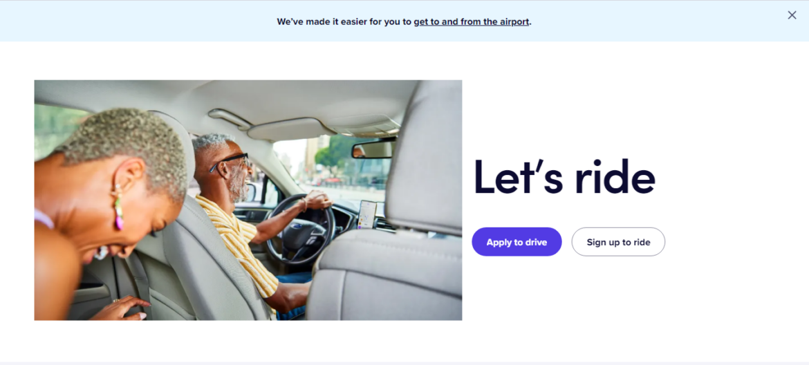
Why This Landing Page Design Works
- The design is minimalistic, with no unnecessary distractions to divert attention from the page goal.
- The signup form has a single form field, which improves the likelihood of successful registration.
- Images play a significant role in evoking an emotional response from users and reinforcing their motivation to take action.
- The CTA button emphasizes the action that Lyft wants you to take. The less desired action is not as easily noticed.
7. OptinMonster
If you are in need of a landing page design from a SaaS business, this example from OptinMonster is worth considering. The agency solutions sales page contains all the necessary elements for a landing page that converts well.
The brand uses effective color schemes and employs various tactics to optimize conversions, which will be discussed in detail.
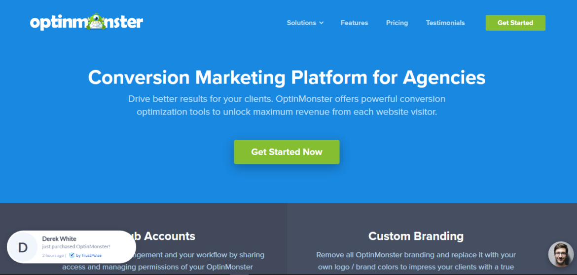
Why This Landing Page Design Works
- The page is divided into sections, which makes it more convenient to locate the desired information.
- The value proposition on the header effectively captures attention and guides users to the subsequent step.
- The features section highlights the advantages of the software.
- View customer testimonials to get a sense of their opinions on the software.
- Images and gifs provide a visual representation of the software’s functionality.
- This page includes recent sales notifications and a live count of the number of people the software serves, indicating its popularity.
- CTA buttons can be found throughout the page, providing convenient options for users to make purchases.
- Live chat allows users to receive immediate answers to their questions.
Ready to Build your Landing Page for Success?
Creating a successful landing page requires attention to small details that will have an outsized impact on your message and conversion rates. It all starts with choosing the right landing page builder to allow you to easily set your business up for success.
No matter how great the design or content is, it won’t convert if users can’t find what they are looking for when they land on your page. That’s why it’s important to focus on the fundamentals of effective landing page design when you are ready to build a page.
When building a landing page, be sure to craft compelling headlines and effective calls-to-action that speak directly to your target audience. Proper use of visuals, colors and videos should be included as well.
It is also essential that the landing page is optimized so visitors can easily get around and quickly locate relevant information without becoming overwhelmed by too many choices.
Last but not least, testing is essential for improving your overall success rate with any design project. Make sure to run A/B tests on different versions of your landing pages in order to determine which combination yields the highest conversion results over time.