|
Getting your Trinity Audio player ready...
|
Your website plays a crucial role in your digital marketing strategy. This is frequently the initial encounter customers have with your business. Incorporating a visually appealing, high converting splash page can effectively showcase your advantages and persuade customers to further explore your website. But what exactly is a splash page?
In this post, we’ll explore the concept of splash landing pages, why they are important for your website’s conversion rates, and provide you with practical tips on how to create effective splash landing pages. If you’re a digital marketer or a business owner seeking to make a great first impression and increase your conversions, this post is for you.

A splash page is a web page specifically designed to captivate and engage visitors when they first land on your website. It serves as an introduction to your brand or product, showcasing a compelling message or offer that entices visitors to take further action. These pages are often visually striking and contain minimal distractions, allowing visitors to focus solely on the desired call-to-action.
The purpose of splash pages is to deliver a more creative and engaging user experience than a standard website page. Splash pages typically appear as soon as a user visits the page, displaying an eye-catching image or video.
Generally the purpose of these splash pages is to provide some sort of promotional message or discount code that entices the user to take part in the offer and drives them towards a product purchase or sign up for a newsletter.
Furthermore, users should be able to easily navigate away from the splash page with an obvious clickable link at the bottom of the page, which enables them to explore other areas of your main webpage.
Splash pages are particularly useful for business websites that require content marketing and PR campaigns in order to be successful. For example, if you’re launching a new product then a splash page can be vital in delivering this information quickly as well as highlighting any special offers linked with it.
Introduction to Splash Pages
A splash page is a type of web page that serves as an introduction or entry point to a website or landing page. It can be used to make a strong first impression, offer a more direct path to conversion, or present a compelling offer to visitors before they get to the homepage. Splash pages are often used to promote offers, show warnings or disclaimers, or call attention to time-sensitive announcements. They can be used to create a memorable brand experience, share an offer, promote a new product or service, streamline the user experience, communicate important business updates, put up an age verification gate, and more.
What is the difference between a splash page and a landing page
Understanding the differences between a splash page and a landing page is key for any website owner. The page vs landing comparison will help clarify their unique functions and design purposes.
Splash pages are an introduction page to your website that may include a logo and tagline. It’s typically designed with several visuals, such as gifs or flash animations, and tends to be short in content – but powerful in its impact. It’s often used as a gateway page that redirects viewers to the main page of the website or specific sections within it. Splash pages also eliminate any distractions so that visitors are presented with one main message or goal.
Conversely, a landing page has much more quality content than a splash page does; Think of it like an all-in-one package – there are graphics plus words that have to work together seamlessly. Splash page vs landing page distinctions are crucial for understanding their roles in user experience and conversion strategies.
More specifically, they focus on helping viewers understand why they should choose you/your company over another option. They go beyond just look and feel as well – in many cases, they might contain interactive elements like videos, games or forms that ask visitors for additional information and input when they hit your site. Landing pages let
A splash page is basically a full-screen web page that one comes across when first visiting the website. It contains only visual content such as images, videos or graphics and it is used with the aim of providing an introduction to the webpage in question. These types of pages are usually short and simple, not containing any other content apart from flashy visuals.
On the other hand, a landing page is typically used for marketing purposes. They usually contain lead capture forms, subscription forms as well as call-to-action buttons targeted directly at potential customers. A squeeze page, for instance, is a type of landing page specifically designed to capture email addresses through opt-in forms.
Landing pages are more structured than splash pages and tend to have more interactive elements and sections within them geared towards getting conversions from visitors. In addition, they focus on presenting a specific product or service while enabling users to take an action such as downloading or signing up for something.
Why is Splash Page Important?
Splash landing pages play a crucial role in converting website visitors into leads or customers. By creating a captivating and personalized first impression, you can significantly increase the likelihood of visitors taking the desired action, such as signing up for a newsletter, making a purchase, or requesting more information.
According HubSpot the average landing page conversion rate across all industries is 9.7%, this is a good number given the benchmark of 10%. This means that by optimizing your splash pages, you have the potential to boost your business’s profitability and overall success.
Furthermore, in today’s fast-paced digital world, capturing the attention of your visitors within the first few seconds is essential. Research shows that you have a mere 5 to 10 seconds to make a favorable impression before visitors decide whether to stay on your website or leave. A well-crafted splash landing page helps you make the most of this critical window of opportunity.
When to Consider Using a Splash Page
Splash pages are used to give website visitors the first visual impression of a website. They usually come before the actual homepage and can be used for a variety of purposes.
They are also known as “entry pages” since they act as gateways to your site. A splash page can be used to promote a product or service, communicate important information, advertise a discount, put up an age verification gate, and more.
No matter what its function is, splash pages typically have several consistent elements – links (to and away from) the main website, visually appealing logos and graphics, short introductions about what you do or offer, colorful backgrounds with contrasting text color schemes that stand out and make it easy for visitors to quickly scan the page’s content. All these features help make an attractive first impression that gives potential customers more confidence when visiting your website.
When creating a splash page for your business or organization, it is important to carefully consider the purpose and message of the page in order to ensure that it accurately reflects your brand image. Additionally, including an exit link can provide users with a way to navigate to the main site, enhancing their overall experience.
Real Splash Page Examples
To help you understand how splash landing pages work in practice, let’s take a look at a splash page example:
1. Ikea
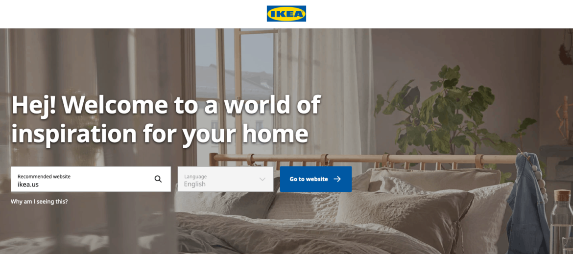
The Ikea website features a modern and comprehensive design that seeks to provide an efficient user experience from the get-go. Upon arriving on the site, visitors are welcomed with a splash page featuring their country’s flag in the corner – creating an immediate sense of recognition and also allowing users to select which site they want to visit based on their location. This is immensely helpful for avoiding any confusion as to where goods are sold and/or shipped.
In addition, there is a considerable focus towards detailing even within those first seconds. The headline regarding “Welcome” is very clear and concise, and there is also a reassuring “why am I seeing this?” link underneath; reinforcing the idea that this particular user journey has been made easier for them by Ikea being cognizant of it upfront.
Meanwhile, alternative links exist should users wish to learn more about what Ikea has to offer in general – all contributing towards better user experience overall. Ultimately, it appears as if ease-of-access was a major consideration when designing this interactive entryway into Ikea’s digital realm which serves as an exemplary feature of the online store’s modernization
2. Bell’s Brewery
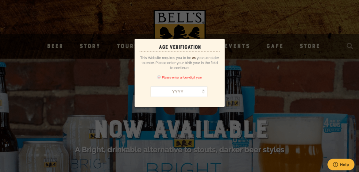
Bell’s Brewery’s age verification splash page is easy to navigate and understand. There is no confusion as to what visitors must do. Simply enter their age to begin accessing the website. The design of the page includes a blurred homepage in the background, which directs attention to the age verification form. It acts as a reminder that visitors must take this step before continuing on. In order to keep visitors engaged, Bell’s Brewery also uses simple copy and call-to-action buttons that make navigating seamless.
The overall effect of Bell’s Brewery’s age verification is that it encourages patrons to stay on their website without feeling overwhelmed or confused by technology or information. This is important for businesses like breweries who want customers to return loyalty and trust, which can be easily lost if someone feels misunderstood or put off before they ever get inside. As such, Bell’s Brewery chose an effective method and design for ensuring legal access and making sure any visitor gets the most out of their online experience with them.
3. Casa
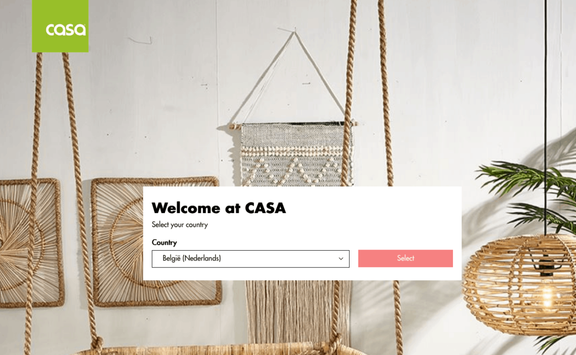
Casa is a home goods store that offers shoppers a variety of products in several countries around the world. Through their splash page, Casa ensures all visitors have access to a language-appropriate version of their website. This helps them offer up the most optimal experience to all visitors regardless of their location and native language. Visitors can easily select their country from the homepage in order to be guided to the right version for them.
This form of personalized touch makes Casa stand out in a strong way among other online stores. They acknowledge different languages and cultures, providing accessible shopping experiences that truly cater to all kinds of customers no matter where they’re located or which language they speak. By understanding the needs and preferences of each customer on an individual level, Casa has earned its place as one of the top international online retailers in the market today.
4. Forbes
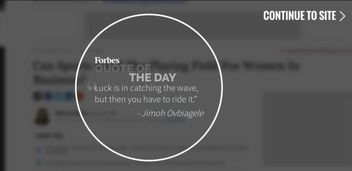
Forbes has been a trusted business publication for many years, and rightfully so. It has been providing readers with insightful, thought-provoking content and reliable news since 1917. One element of Forbes that married well with its reputation is the “Quote of the Day” splash page featured on the website. The monochromatic design of this page contains clean and decluttered elements, making it easy to read and focus on the quote or thoughts delivered each day.
Some days the welcome page features nothing more than a short inspiring quote while other times an ad or list of articles will be displayed promoting brand initiatives which result in overall site clicks. This is just one way that Forbes ensures visitors to their website get something out of every visit most likely gaining something from a new perspective or idea. This is one way Forbes helps keep readers engaged by providing a plethora of options to keep up with current events and offering quotes for personal growth.
5. Legwork Studio

Legwork Studio was a creative shop based in Denver, Colorado that brought unique and innovative digital platforms to their clients. Unfortunately, they had to close their doors for good but wanted to do it in a way that honored the work they did while also being honest about the closure. To achieve this goal, they created a fully interactive experience on their website.
When visitors go to the Legwork website, there is no question that the shop has ceased operations. A straightforward message greets them right away and confirms what has happened. Visitors can then learn more about Legwork by clicking on various cards on the page that highlight some of their most impressive works. Through this site, Legwork strives to bring new people closer and make sure everyone remembers why it contributed to the creative field so greatly.
Anatomy of a Website Splash Page Design
A splash page design is the first page of a website that often functions as an introduction and is specifically designed to capture the attention of visitors.
A loading screen can serve as a transitional element, enhancing user experience by providing smooth navigation while conveying branding messages or promotional content.
Splash pages typically feature high-quality visuals, minimal copy, and a call-to-action (CTA), all of which help inspire action from visitors. With visuals at the forefront, splash pages should contain professional photography, illustrations, videos, or animation thumbnails to captivate viewers.
Large bold headlines with concise copy can also create an impact on visitors and convey key messages about your business or product in just a few words. A clear CTA needs to be present so users know what action they need to take once their interest has been grabbed by the visuals and enticing headline on the landing page.
Integrating quality visuals, concise but punchy copy, and a well-defined CTA into the layout of a splash page design, will effectively direct users through their user journey.
High-quality visuals
High-quality visuals are essential for making a good first impression on potential customers. An effective visual should be both aesthetically pleasing and relevant to the user’s interests. It also needs to be on-brand, helping create an identity for your business that customers can trust and identify with. If you fail to make use of visuals effectively will likely see higher bounce rates as users quickly exit your website after entering it.
Splash screens can be used to alleviate wait times during page loads, especially for mobile users. Engaging users with creative elements and gamification techniques on splash screens can keep them entertained while waiting.
There are several types of visual media available to businesses when creating content for their websites, such as background images, product photography, video, and animation. Each type of media presents its benefits and drawbacks depending on the individual context they are used in. This is something that needs to be taken into account when developing high-quality visuals.
Video media can often slow down download times if not optimized correctly, while adblockers may lead some users to not be able to view this kind of content at all. As a result, it is wise to choose the right type of image-based media which best meets both your branding and audience needs.
Minimal but punchy copy
Writing minimal but punchy copy is challenging, yet essential in 2020 when over 4.2 billion unique global mobile internet users were recorded. 90% of the worldwide internet population uses a mobile device to access information; this means that long and wordy text blocks won’t do you any favors in terms of engagement or reaching your target audience. Focus on writing clear, concise texts that have an element of action orientation and direction.
A standalone page is designed with a singular focus on conversion without distractions such as navigation links, making it essential for driving traffic and facilitating targeted campaigns.
Your copy should never exceed more than a few sentences, but instead should provide simple instructions directed at the user – whether it’s to sign up for membership, purchase a product or take advantage of a sale. Clarity is key; use active verbs and phrases to encourage readers to take specific actions rather than writing long passages which can be cumbersome on smaller screens. Keep it brief and make sure your content makes users act quickly.
A call-to-action (CTA)
One of the most effective and efficient call-to-action (CTA) techniques to implement on a website is age verification. This allows promoters to ensure that site visitors are legally allowed to access any content labeled with an age restriction. This helps protect businesses from legal liability, while also providing potential customers with a heightened sense of safety and protection when dealing with sensitive materials.
A splash screen can serve as a welcome screen that presents visitors with important messages or promotions before they access the main content of a website. It enhances user experience by providing information such as disclaimers or age verification, engaging users effectively from the first impression.
In addition, CTAs can be used to provide users with the information they need for the best experience possible on your website. CTAs announcing requirements such as having sound on, using Flash Player, or running on specific browsers can ensure that users have access to all interactive elements available. By providing clear instructions their satisfaction and engagement with your brand will subsequently increase as well.
You can also use CTAs to get customers’ emails in exchange for enticing offers like discount codes or new product announcements. This will help you to capture potential customers’ attention and draw them into making purchases or signing up for your email list. With the right CTA designations, businesses can reach out directly to target audiences cultivating maximum response rates from their market base.
Best Practices for Splash Page Design
When designing a splash page, there are several best practices to keep in mind. First, keep it simple and visually appealing. A typical splash page should have very few elements, including high-quality visuals, a clear call-to-action, and a concise message. The page should be easy to exit, and the call-to-action should be prominent and clear. It’s also important to consider the user experience and make sure the page is optimized for speed and mobile devices.
Technical Considerations
SEO and Splash Pages
Splash pages can impact SEO, for better or worse, depending on how they’re designed and implemented. A key challenge is making sure search engines can crawl and index the site effectively. To avoid SEO issues, use a splash page that loads with JavaScript or HTML overlays. Make sure the splash page is optimized for page load speed, and use a clear and concise message that includes relevant keywords.
Measuring the Effectiveness of Splash Pages
To measure the effectiveness of a splash page, track metrics such as conversion rates, bounce rates, and time on page. Use analytics tools to see how visitors are interacting with the page and make adjustments accordingly. It’s also important to test different variations of the splash page to see which one performs best. By tracking and analyzing the performance of the splash page, you can make data-driven decisions to improve its effectiveness and drive more conversions.
Ready to turn more clicks into conversions?
Splash landing pages are powerful tools for increasing your website’s conversion rates. By providing a captivating first impression and guiding visitors toward the desired action, you can drive more leads and customers to your business.
A Splash Landing Page is a webpage designed to quickly capture the attention of website visitors. It’s usually a single page – without navigation menus and other distractions – that contains an appealing headline, attractive visuals, and compelling text.
This type of page typically exists outside the main navigation structure of a website, with its purpose being to provide visitors with important information before they can access the rest of the site. Common uses for splash pages include introducing a new product or service, directing visitors to a special offer, and providing subscription options.
Remember that the success of your splash landing pages relies on a deep understanding of your target audience. Continuously monitor and analyze the performance of your pages, adapting them to meet evolving customer preferences and behaviors.
For more in-depth insights and strategies for improving your website’s conversion rates, be sure to check out our other resources in our website’s blog section.
Ready to create your spelling splash pages and boost your conversion rates? Pick from one of the best landing page builders we have reviewed to reach your conversion goals.
Remember, a captivating first impression can make all the difference in converting visitors into valuable leads and customers. Start implementing splash landing pages today and watch your conversion rates soar!